
Airlines Application
Timeline: January 2023
Platform: Mobile Application
Role: Lead Designer & Researcher
Introduction
Portfolio Project #1
In order to improve my skills as a UI/UX Designer I have been practicing using the 'Daily UI Challenge'. This activity involves getting random prompts daily and designing a page/screen/component that fits with the theme of that prompt.
One of the prompts I received was 'Boarding Pass' which I then created a screen for. After completing my 'Boarding Pass' Screen, I was proud of the design and decided to realize this screen into a full application and use it as a portfolio project.

My Role
I led the entire design process for this project from end-to-end.
My responsibilities included: Project planning, user research, wireframing, prototyping, high fidelity designs and testing the prototypes.
Problem
1 / Access to boarding pass instantly
During my research, one problem that I found frequently in other airlines apps is the lack of a quick access for a user's boarding pass. This feature is extremely convenient to users especially in crowded airports who may have to quickly present a boarding pass when asked. I found the lack of such a feature in many apps to be frustrating as a user.
2 / Overcrowded and intimidating for new users
Launching many airlines apps for the first time, you're often greeted with home pages that are filled to the brim with information, deals, notices and such. When a new user is interacting with such an app, it can be intimidating as they find themselves overwhelmed and unsure of how to proceed with their user journey, so one of the major paint points I aimed to address was creating a clean and digestible user experience that guides the user to their necessary steps for satisfaction.
3 / Lack of discovery for trips
For users who are browsing to generate ideas on where to go for their next trip or are simply curious, I wanted to provide them with various discovery components to browse upcoming trips, trips with special deals and just generally browse. This would help convert users from potential customers to registered trip takers by presenting them an easy and engaging discovery experience.
Ideation
My design process began with researching existing airways apps like Emirates, Etihad Airways, IndiGo, British Airways etc.
I used these applications and noted down some of the aspects I liked and disliked about them as well as things I would've liked to see as a user.


Thereafter, I began to use sites like dribble, behance and awwwards to find inspiration, see examples of UI's for this type of app as well as identify components/aspects I like and can implement into my own designs.
Once I had a rough idea of the pages and components needed for my application, I created a high level user flow that outlines a general user journey throughout the app. This is obviously subject to change but I noted down the squares as pages which will need designs and circles as actions the user will take when navigating the application.

After that, I began wireframing, which usually takes a few iterations till I arrive at a general design I'm content with.
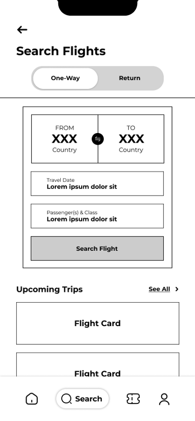
Wireframes


High Fidelity Designs


Design System


Testing
In order to test the user experience, I conducted a usability study with 4 members of varying ages/occupations. This usability study was conducted in the wireframe stage as well as the high-fidelity stage.
Usability Study Findings:
1. Not clear whether a ticket is one-way or a round trip (to remedy this, I added the switcher at the top of the search page as seen in the above wireframes).

2. A user may have multiple bookings (to remedy this, I showed dots below the 'Your Trips' section to signal to the user that they can swipe between multiple trips if they have them).

3. A user may want an offline copy of the boarding pass to print (to remedy this, I added a 'download ticket' option at the bottom of the boarding pass).

4. Some text sizing inconsistencies were found (this simply involved adjusting the text sizes and colors in some cases to make it more visible for the user). Below is one of the examples of text inconsistencies.


Future Steps
1 / Further Testing
The usability studies conducted for this project were done with a small sample of users. As a result, to further understand the experience from a user perspective, this should be tested with more individuals of varying proficiency with this type of service.
2 / Further Iterations
Once more user feedback is received and I'm able to understand the user journey further, the designs and prototypes should be adjusted and iterated upon to accommodate user feedback.
3 / Maintain and Update Project
Over time, I will have to maintain this project by constantly updating it with current design trends and principles and ensuring it matches what a user will expect.