
E-Commerce Application
Timeline: January 2023
Platform: Mobile Application
Role: Lead Designer & Researcher
Introduction
Portfolio Project #2
In order to improve my skills as a UI/UX Designer I have been practicing using the 'Daily UI Challenge'. This activity involves getting random prompts daily and designing a page/screen/component that fits with the theme of that prompt.
One of the prompts I received was 'E-Commerce App' which I then created a screen for. I felt that my completed screen could be improved quite a bit and decided to instead tackle it as a full scale project instead.

My Role
I led the entire design process for this project from end-to-end.
My responsibilities included: Project planning, user research, wireframing, prototyping, high fidelity designs and testing the prototypes.
Problem
1 / Long checkout journey
One common complaint of E-commerce apps are the long user journeys to get from opening the app to confirming a purchase. Having to go through multiple confirmation pages, address pages, payment options, sign up pages, etc. deters users from completing a purchase. As a result, I aimed to create a simple but quick user purchase journey to ensure users aren't being lost due to a lacking user experience.
2 / Too many functions
Many established apps end up adding function after function to their application which not only crowds the UI but it also raises the barrier of entry for new users as they can often find themselves overwhelmed and unsure of where to start. I wanted to ensure to provide users all the essentials and guide their user journey more effectively. More advanced features would still be included but not highlighted as to avoid crowding the UI, these features would be aimed at power users who are more comfortable with digging deeper.
3 / Ineffective search and product discoverability
Almost all successful E-commerce businesses stress the importance of product discoverability and search optimization as this is what leads users into more unplanned purchases and consistent engagement with the platform. As a result, I wanted to ensure robust product discoverability by through the user of good search, filters, tags, product collections etc.
Ideation
My design process began with researching existing airways apps like Amazon, Noon, eBay, Tabby, Alibaba, StockX, etc.
I used these applications and noted down some of the aspects I liked and disliked about them as well as things I would've liked to see as a user.


Thereafter, I began to use sites like dribble, behance and awwwards to find inspiration, see examples of UI's for this type of app as well as identify components/aspects I like and can implement into my own designs.
Once I had a rough idea of the pages and components needed for my application, I created a high level user flow that outlines a general user journey throughout the app. This is obviously subject to change but I noted down the squares as pages which will need designs and circles as actions the user will take when navigating the application.

After that, I began wireframing, which usually takes a few iterations till I arrive at a general design I'm content with.
Wireframes


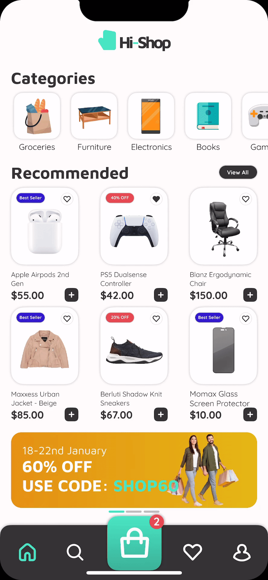
High Fidelity Designs


Design System


Testing
In order to test the user experience, I conducted a usability study with 4 members of varying ages/occupations. This usability study was conducted in the wireframe stage as well as the high-fidelity stage.
Usability Study Findings:
1. Something that was noted multiple times was that items with longer names may not be easily recognizable due to the lack of test length for item names (to remedy this, I increased the space for the item and decreased some text sizes to allow for longer names).

2. When scrolling, items cards and banners showed underneath the bottom nav which looked unappealing (to remedy this, I changed the cart button from a punch hole design to an overlay one).

3. A user noted that the shadows under item cards were a little strong and distracting (to remedy this, I simply decreased the strength and opacity of the shadows).

4. Some users were unable to quickly find the search button/functionality which was especially problematic in a page dedicated to search. (to remedy this, I created a search bar to be put front and center rather than the search button being next to the filter button).

5. When users visited the cart page the page indicator looked out of place and often mixed in with the black bottom nav background (to remedy this, I opted to fill in the cart icon rather than change the button color when pressed).

Future Steps
1 / Further Testing
The usability studies conducted for this project were done with a small sample of users. As a result, to further understand the experience from a user perspective, this should be tested with more individuals of varying proficiency with this type of service.
2 / Further Iterations
Once more user feedback is received and I'm able to understand the user journey further, the designs and prototypes should be adjusted and iterated upon to accommodate user feedback.
3 / Maintain and Update Project
Over time, I will have to maintain this project by constantly updating it with current design trends and principles and ensuring it matches what a user will expect.